Area Chart
An area chart is similar to a line chart, except the area below the line is filled to indicate volume. Different volumes can be overlapped. When multiple variables are compared, the fill color should be transparent so data is not hidden.
CONTAINERS OF PRODUCE PURCHASED
Stacked Area Chart
Alternatively, an area chart can compare values by stacking them. This also allows you to relate each value to the total.
CONTAINERS OF PRODUCE PURCHASED
Scatter Plot
A scatter plot displays a series of points. The position of each point is determined by its relationship to the horizontal and vertical axis.
GEYSER ERUPTIONS
Bubble Chart
A bubble chart uses the area of a circle to add a third axis of information to a representation of a series of values.
PARTS SOLD
In this example, time, cost, and quantity are represented. In this case, the area of the circle represents the quantity of parts. Further below, bubbles are overlaid on a map showing quantity in relation to location.
PARTS SOLD
Bubble Map
PART SALES
Pie Chart
A pie chart is a circle divided into sections proportional to percentages. A pie chart works best when comparing only 2-3 values, as it becomes difficult to distinguish proportions when the number of values increases. If more than 3 values need to be displayed, a bar chart is probably a better option.
Standard Pie Chart
PERCENTAGE OF PIES SOLD
Donut
Nested Donut
A donut chart is a pie chart with the center removed. Both are equally delicious when used in moderation. The knocked out center gives additional space for labeling or nesting other charts while maintaining the proportions of the values.
Half Pie
Half Donut
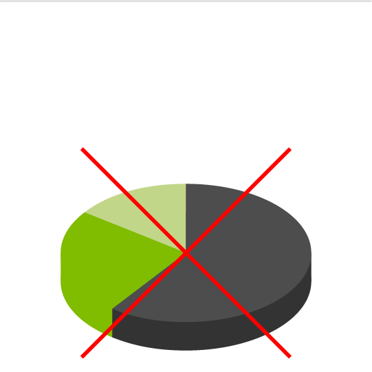
Skewed 3D Pie
3D Pie (non skewed)

Skewing a pie chart with 3D effects should typically be avoided. This kind of effect skews our perception of the data, making it less accurate and less effective. Portions of a pie chart can be called out by applying non-skewing depth. When in doubt, it is best to keep pie charts flat and circular.
Polar Area Diagram
The polar area diagram is like a pie chart, but the sectors are the same angle and differ by how far they extend from the center. This chart type is best used to plot cyclical data.
Radar Chart
A radar chart is a graphical way of displaying data with three or more variables. Each axis starts from the same point. Like the polar area diagram, this chart works well for comparing cyclical data.
NUMBER OF PIES SOLD
Keep your charts simple
Although it can be tempting to embellish charts to make the data look more important or a presentation more flashy, a good chart should be as simple as possible and easy to read. Here is an example of how not to do it, followed by suggestions about how to make it better.
Don't do this
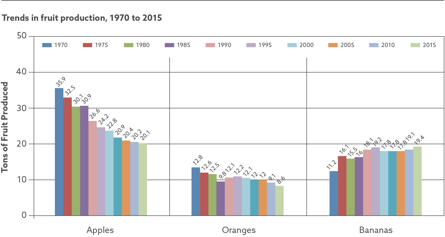
Chart issues
- Color coded date key is overly complicated and serves no value.
- Color key is located in the chart and competes with actual data.
- Chart has unnecessary decoration that distract from data.
- Numbers above bars miss the point of having a chart.
Better
TRENDS IN FRUIT PRODUCTION
Improvements
- Placement of dates and fruit type are switched.
- Visual Structure is simplified and highlights data.
- Bars are distinct colors with ample contrast.
Issues
- Bar chart is not the best way to represent the data.
Best
TRENDS IN FRUIT PRODUCTION
Improvements
- Bar chart replaced with a line chart, which better suits the data.
- The chart now tells a clear and accurate story.
Get Creative
The charts discussed here are just the tip of the iceberg. Each of these chart types was originally created for a specific research need. If you can't find a chart that represents your research data well, don't hesitate to think outside of the box and make something new.
Give us a call at (541) 687 5778 or email us at [email protected]. We would love to discuss your next research project.
CONTACT US TODAYSocial Media
© Emberex, Inc. All rights reserved | View our terms and conditions