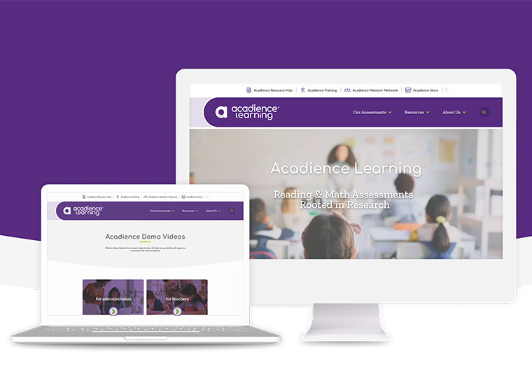


ACADIENCE LEARNING WEBSITE REDESIGN
RESPONSIVE, MODERN WEBSITE FOR AN EVIDENCE-BASED EDUCATION LEADER
Product
A user-centered website redesign that clarifies Acadience Learning’s assessment offerings and improves access to tools, resources, and support for educators.
Project roles
UI & UX Implementation,
Icon Design,
App Development,
Quality Assurance
THE CHALLENGE
Acadience Learning’s website needed to better support a diverse audience of educators, administrators, and partners while presenting an expanding set of research-based assessment tools. The existing site contained valuable content, but complex navigation, dense information, and inconsistent page structures made it difficult for users to quickly understand offerings or locate key resources. Emberex was challenged with simplifying this complexity, improving clarity and discoverability, and creating a scalable foundation that could grow alongside Acadience’s evolving product ecosystem.
THE PROCESS
The redesign of the Acadience website focused on research into how educators, school leaders, and internal teams relied on the existing site and where it fell short in supporting their goals. From this work, key priorities emerged: clearly explaining the assessment suite, creating straightforward paths for getting started, and making support and training resources easier to discover. The new experience was shaped around these needs, with content and navigation reorganized to reflect real-world tasks rather than internal structures, and with an emphasis on clear language and approachable, educator-friendly layouts. By aligning structure, messaging, and design around authentic user workflows, the redesigned site better supports schools and districts as they evaluate, adopt, and implement Acadience solutions.
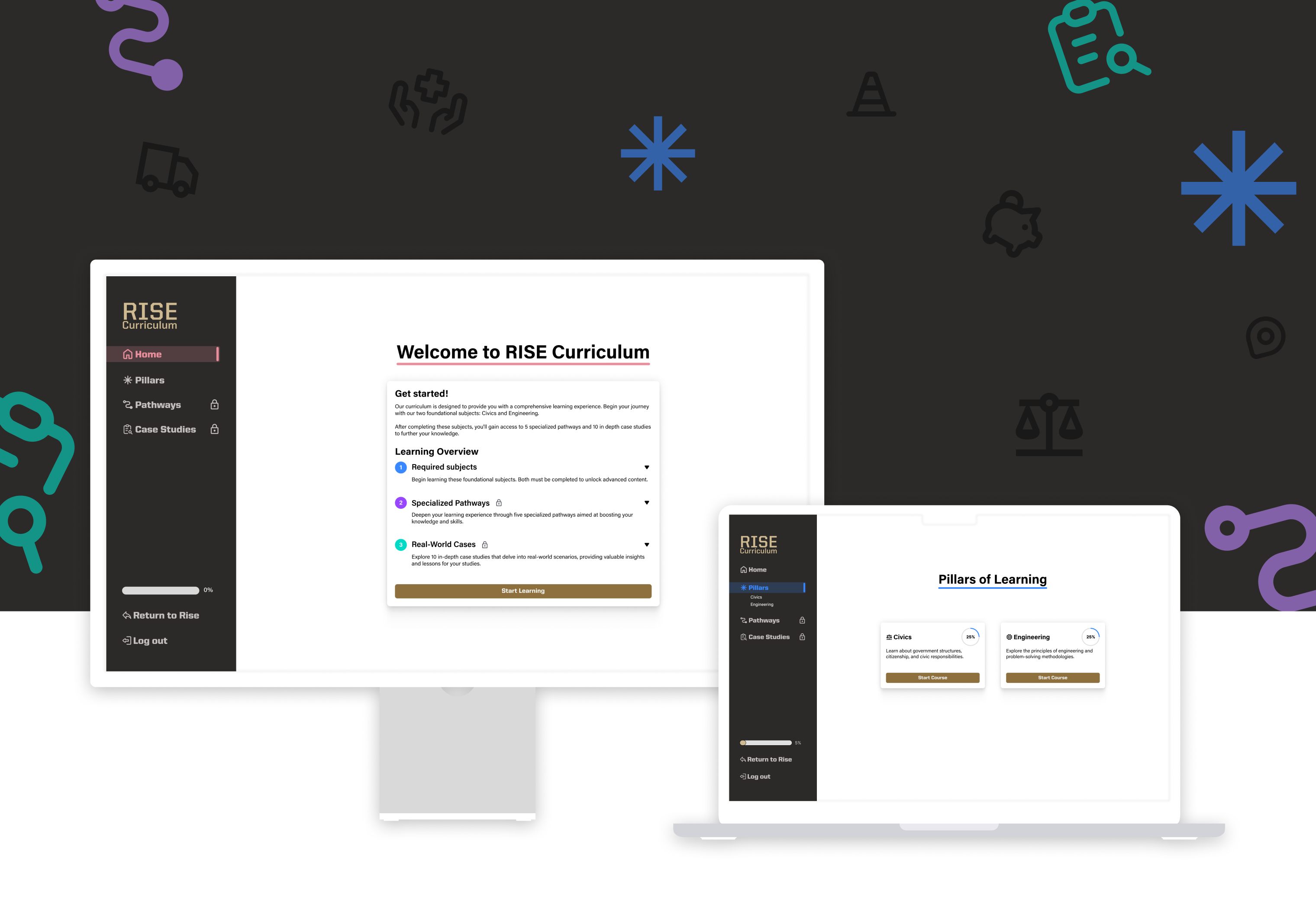
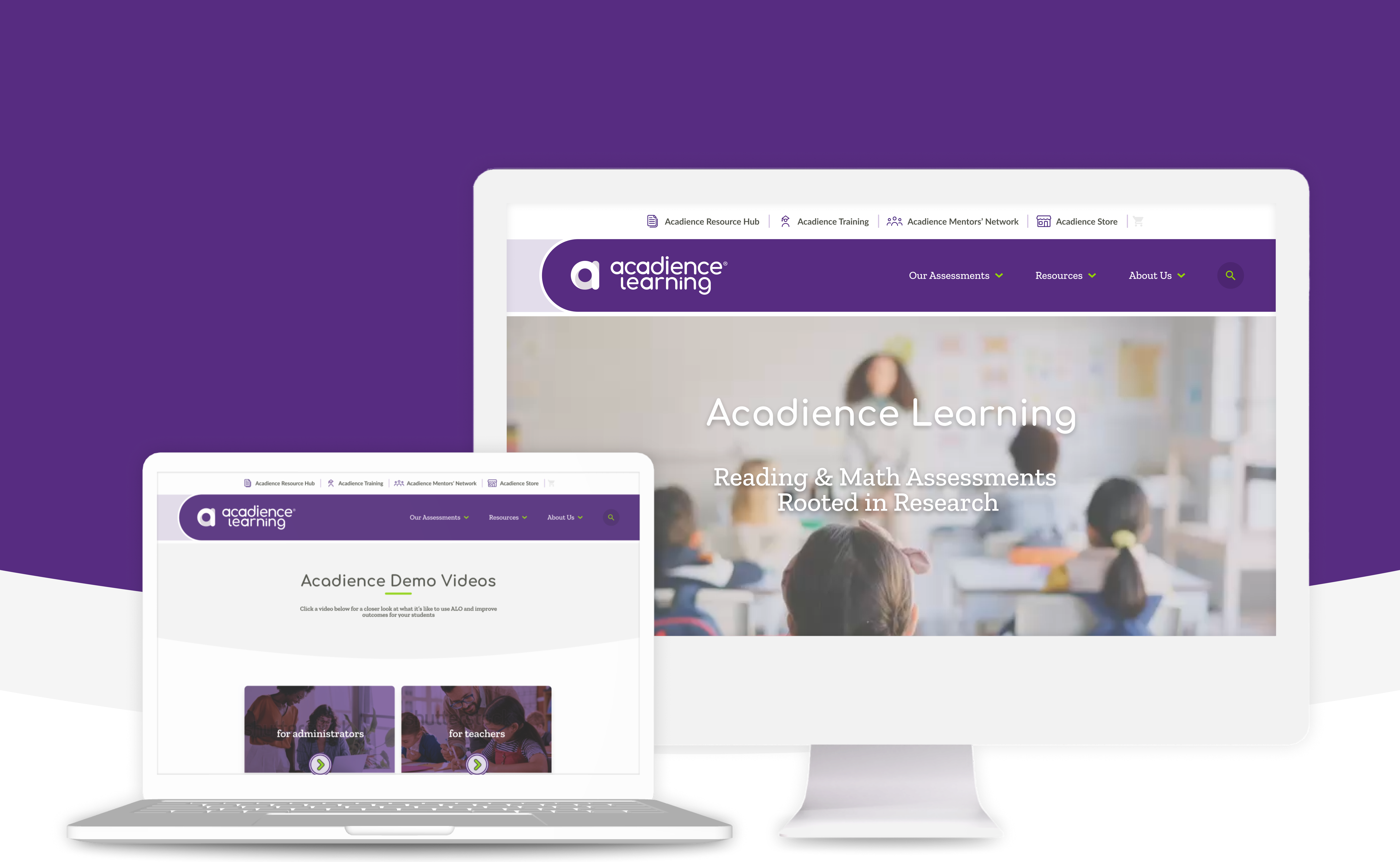
PRODUCT POSITIONING
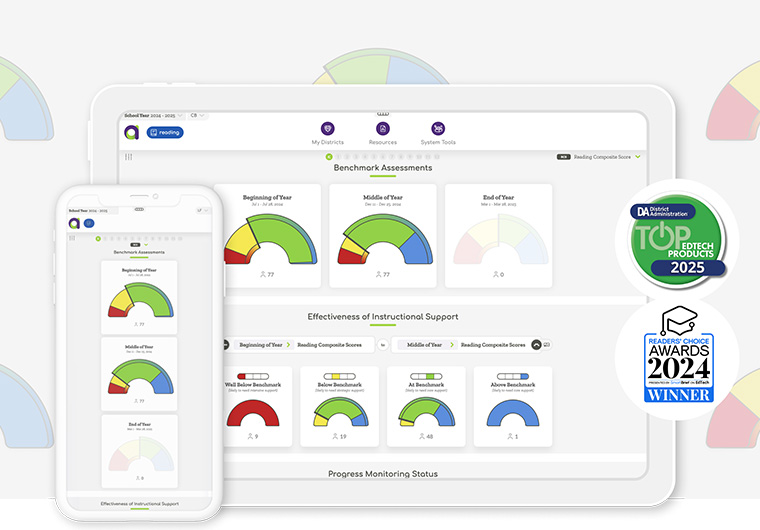
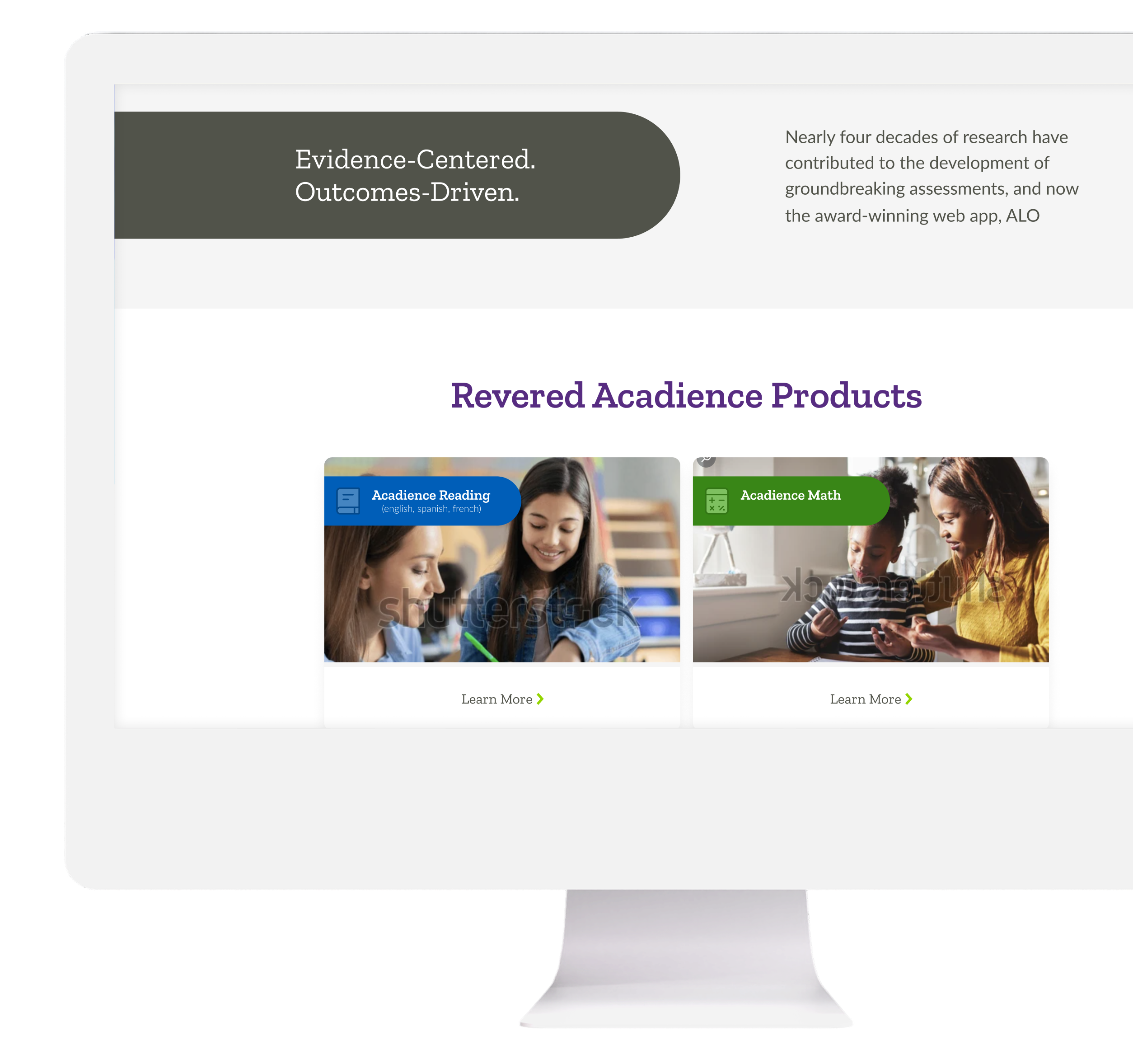
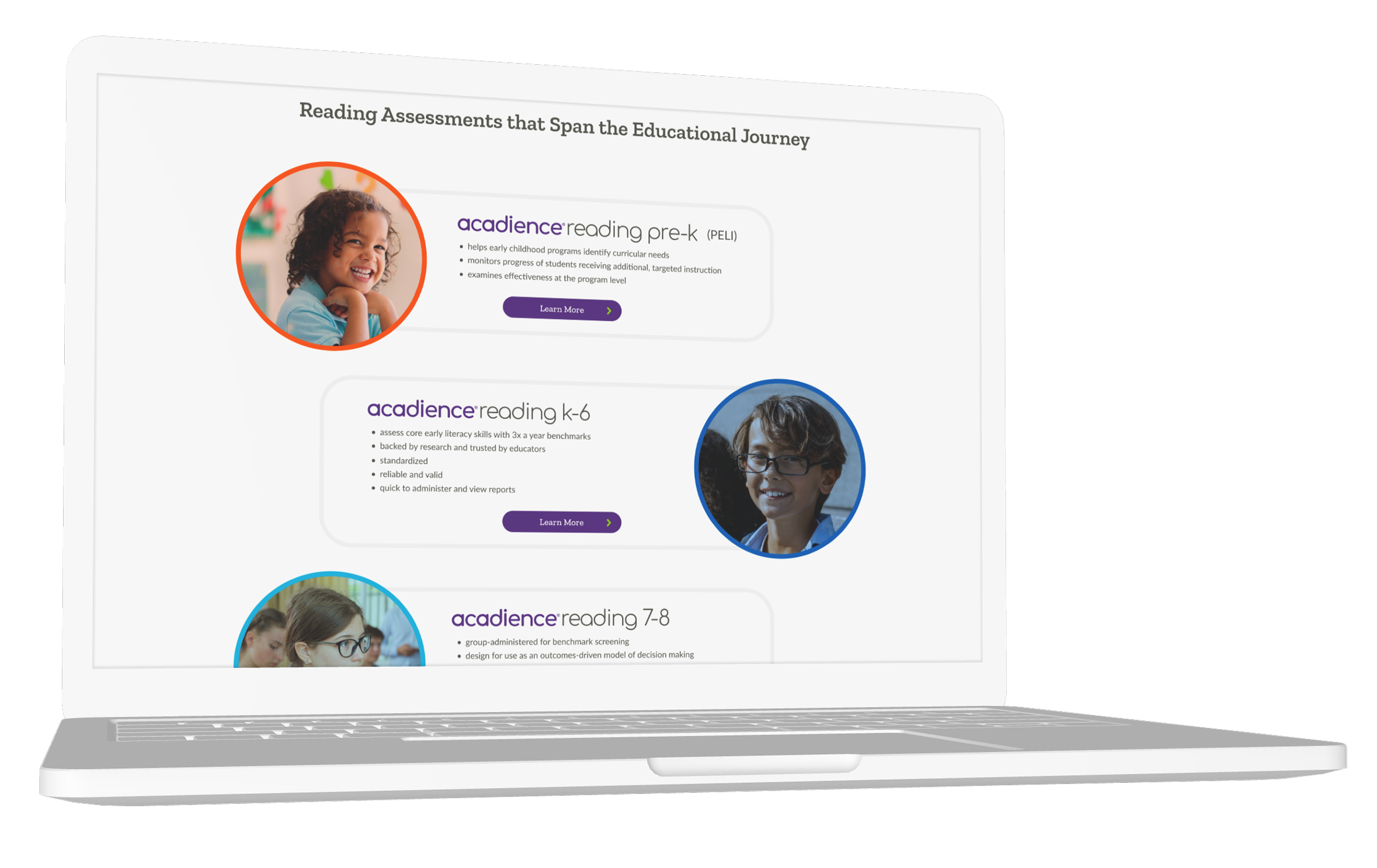
The redesigned homepage immediately clarifies Acadience Learning's core offerings by positioning Reading and Math assessments front and center. Strong headline messaging and supporting visual cues help educators quickly understand what Acadience offers and how its research-based tools support data-informed decision making.
IMPROVED INFORMATION HIERARCHY
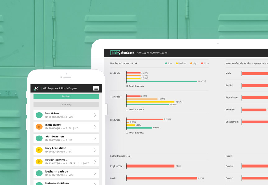
Content is organized into distinct, digestible sections that guide users through key value points, efficient assessments, actionable data, and improved outcomes without overwhelming them. Visual hierarchy, iconography, and spacing reduce cognitive load and allow users to scan and engage with content more efficiently.
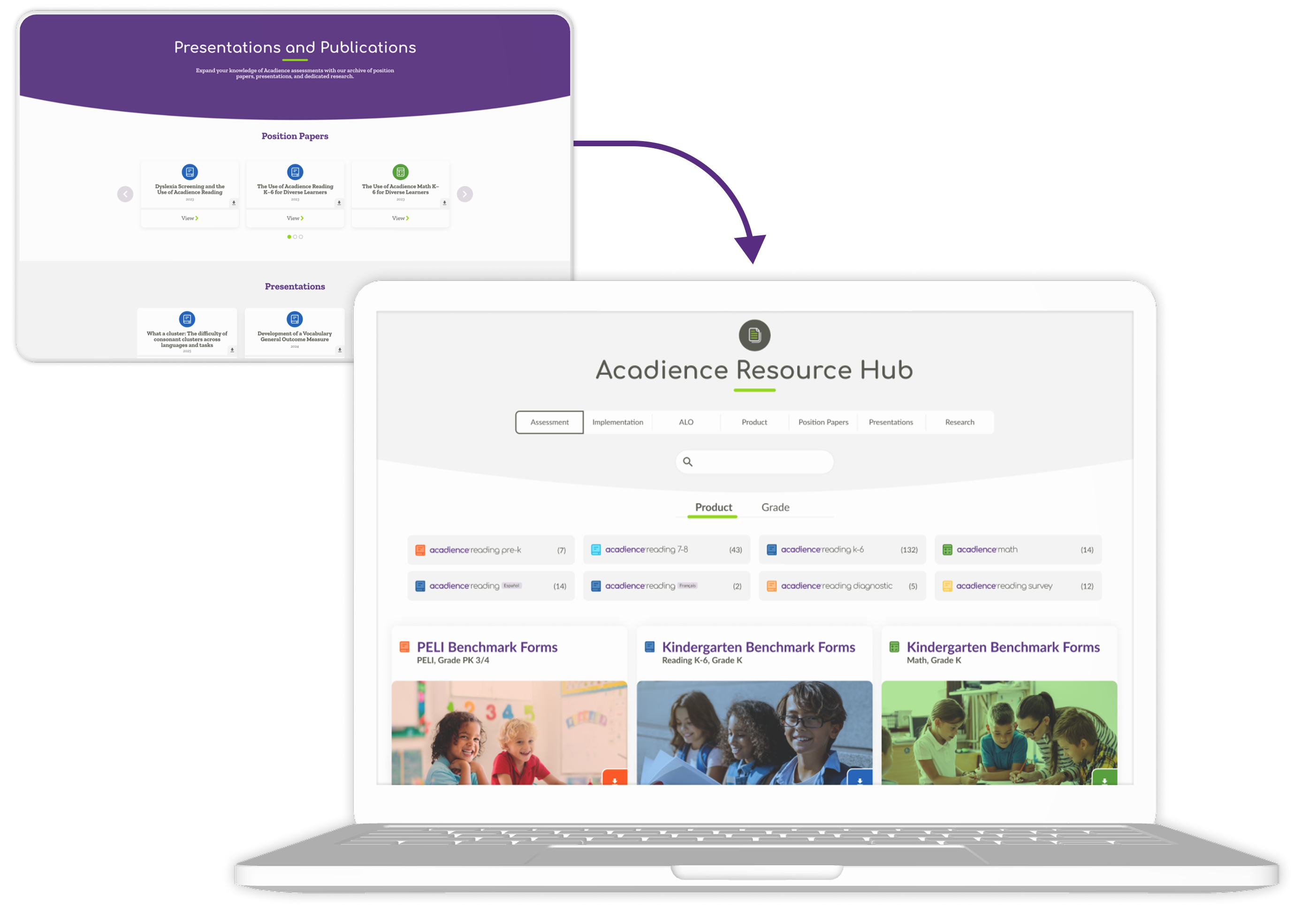
AUDIENCE-FOCUSED ENTRY POINTS
Strategic calls to action and product cards create clear pathways for educators and administrators to explore Acadience Reading, Acadience Math, and implementation options. These entry points help users quickly move from high-level understanding to relevant next steps based on their needs.
THE RESULTS
The redesigned Acadience website delivers a more intuitive, goal‑oriented experience that helps educators and leaders quickly understand Acadience solutions and access the resources they need. A clearer information architecture, streamlined navigation, and stronger visual hierarchy reduce friction from first visit to key actions like exploring assessments, getting implementation support, or contacting the team. Behind the scenes, modular layouts and an updated content strategy give Acadience flexibility to keep the site current as offerings evolve, turning the redesign into a sustainable asset that continues to improve engagement and self‑service support for schools and districts.
TECHNOLOGY
WordPress, Breakdance, Twig/Timber, ACF, AlpineJS, PHP, MySQL, WooCommerce
Social Media
© Emberex, Inc. All rights reserved | View our terms and conditions